This Coca-Cola optical illusion is making me question everything
Creative Bloq
by Daniel John February 26, 2026
AI-Generated Deep Dive Summary
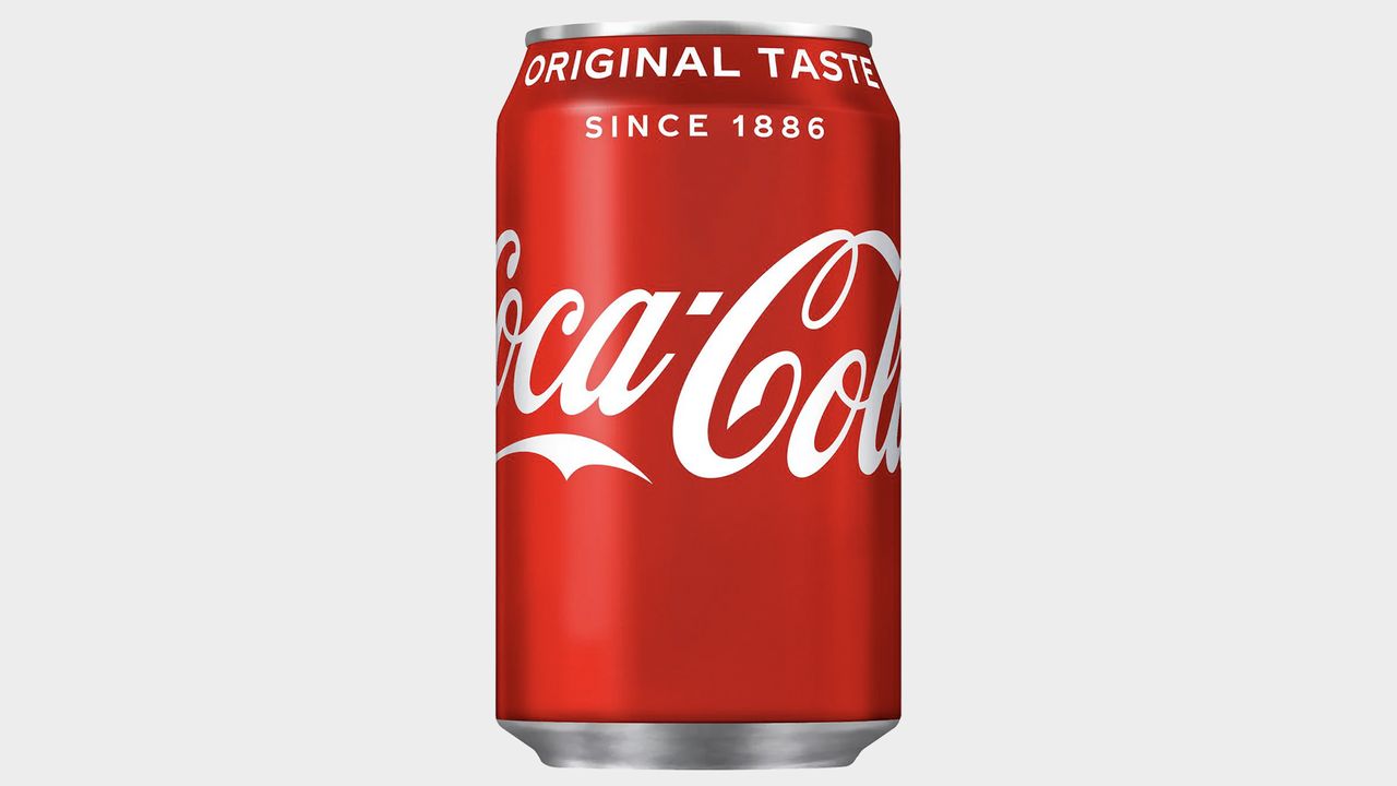
This article explores an intriguing optical illusion involving a Coca-Cola can that appears red but isn’t actually red. The illusion plays on our perception of color, challenging how we interpret visual information. The can’s pinkish hue is perceived as red due to simultaneous color contrast, where surrounding colors influence each other. This phenomenon highlights the limitations and tricks of human vision, questioning our reliance on color recognition in design and everyday life.
The article delves into the science behind this illusion, explaining that cones in the eye responsible for color vision can misinterpret hues when adjacent colors interact. The illusion gained traction on social media, sparking discussions about how expectations shape perception. Many assume the can is red because of its iconic branding, but without context, the true color reveals itself as pink.
For readers interested in design and art, this article underscores the importance of understanding visual perception and optical illusions. Designers can use such insights to manipulate color contrasts for creative effects, making their work more impactful. The illusion also raises broader questions about how we trust our senses and interpret reality, offering valuable lessons for anyone working with visuals or storytelling.
Ultimately, this optical illusion serves as a reminder that color is not always what it seems. By exploring these phenomena, designers can gain tools to better manipulate perception in their work, creating more engaging and thought-provoking designs. The article leaves
Verticals
designart
Originally published on Creative Bloq on 2/26/2026