This ice cream brand makes me want to drift off to sleep (in a good way)
Creative Bloq
by Rosie Hilder February 23, 2026
AI-Generated Deep Dive Summary
Snooz, a new ice cream brand, is redefining the category by focusing on sleep-friendly ingredients and calming, nighttime branding. Unlike traditional ice cream marketing that often highlights sunny or vibrant imagery, Snooz opts for a serene aesthetic with starry nights, silky pajamas, and plush eye masks. The brand’s name and design aim to evoke a sense of relaxation, with an "I want to squish my face into it" vibe. By replacing sugar, emulsifiers, and artificial numbers with sleep-enhancing ingredients like camomile, theanine, magnesium, and lemon balm, Snooz positions itself as a healthier, more mindful treat for evening consumption.
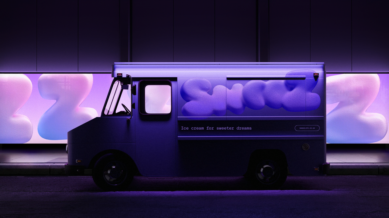
The branding, created by agency How&How, features a wordmark with eclipsed moons forming the "oo" in Snooz, symbolizing sleep and space. Dreamy animations and cool-toned photography—featuring over-exposed flash-on shots of people enjoying Snooz before bed—emphasize the product’s calming qualities. The tone of voice is fun yet inviting, with phrases like “less wired, more tired” encouraging customers to embrace relaxation without feeling forced.
Snooz stands out in the design world by aligning its visuals and messaging with the growing trend of health-conscious consumers seeking products that promote well-being. Its innovative approach to branding not only appeals to those looking for a healthier treat but also sets a new standard for how food brands can connect emotionally with their audience through design. By blending creativity with functionality, Snooz creates a brand experience that feels both indulgent and soothing, making it a standout in the competitive ice cream market.
Verticals
designart
Originally published on Creative Bloq on 2/23/2026